This is a four part blog series on how I wrote a webapp using Razor Pages, added an Azure SQL database, deployed to Azure App Service, and then viewed the results using PowerBI.
Part four - connecting PowerBI to our Azure SQL instance and displaying the results on a dashboard.
Originally when designing the homebrew competition app, I had envisaged having some graphs displaying which brews were winning the competition, the current top brewer, etc. My initial plan was to write this graphing using jQuery and have it native to the web app, but then I had a brainwave - what data visualization tool am I already familiar, with that can connect to a SQL database, perform some ETL, produce pretty graphs and embed them in a webpage?
EXCEL.
(Kidding, I mean PowerBI)
Connecting to PowerBI to a SQL server is very easy, and has the added advantage of supporting Direct Query. Normally, your data is imported into the PowerBI service and cached there. This cached data is what is used to display reports on the PowerBI web portal, and has some limitations around frequency of updates. It's better suited to datasets that you're updating at a slower pace - it (currently) has a minimum dataset refresh time of one hour.
But I wanted a dashboard I could display in the room while we were conducting the competition, and have the results updating "live".
Now, the proper way to do this at scale would be to use a (push) streaming data set, but because we're doing this at a small scale, we can get away with a few tricks.
Direct Query does what it sounds like - when you refresh your report, it queries your dataset directly and displays the latest results from there. Now be warned - there are some DAX limitations in Direct Query, i.e. you can't use all of the available functions (the supported list will depend upon your data source), as PowerBI is just translating your queries into the dataset's query language (e.g., TSQL).
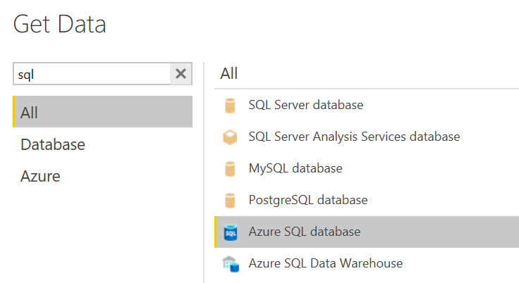
So - open PowerBI, click Get Data, and choose Azure SQL Database
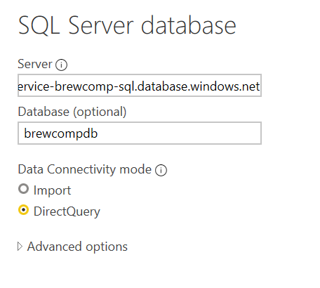
Enter in the connection string for our database from post two, and choose Direct Query
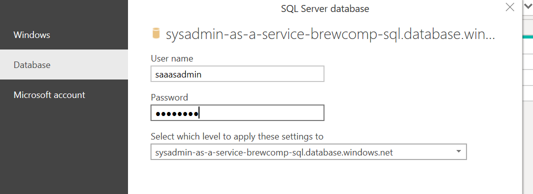
Enter in the database user settings you created earlier
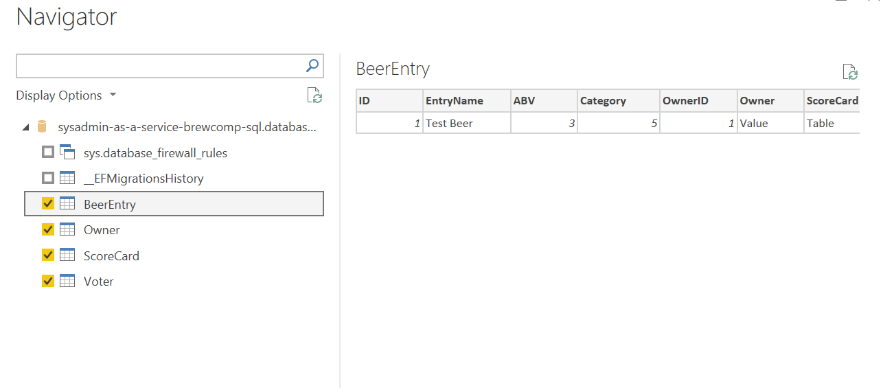
Select the tables we want and click OK
Now that we've got our datasets loaded, we can create relationships, and write any measures or calculated columns we want. Our dataset has a pretty simple relationship model.
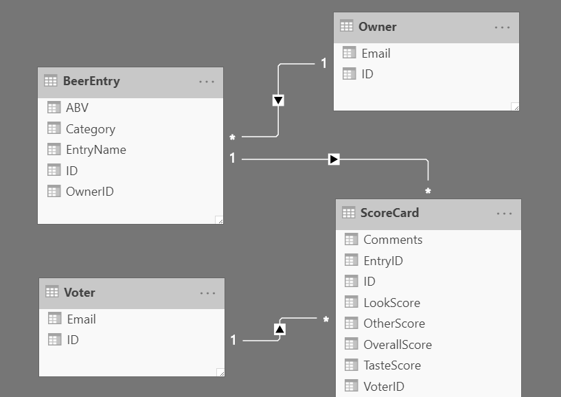
I tend to use single directional relationships unless absolutely necessary - avoid data hell
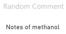
I only had one thing missing from my dataset that I wanted to display on my dashboard. Each of the score card entries (i.e., people rating other people's brews) had a Comment feature, and I wanted to display one of these at random.
To do this, I created a new calculated column on the ScoreCard table with the following formula:
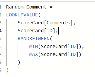
Here, we're generating a random number between the max and minimum ScoreCard IDs, and grabbing the Comment field from that matching ScoreCard entry. Then, using the Card visual we can display one of these comments on our dashboard

Once our "judges" saw that their comments would display on the dashboard, things started to go downhill - which made for a few laughs!


There was one more small trick I employed to get "live" data displaying on our dashboard. Normally (even with Direct Query sources), the PowerBI report will only update the data when you refresh the report - i.e., refreshing the page in the browser (or clicking the Refresh button). I didn't want to have some ugly full-screen browser refresh going every 5 minutes, but I did find this nifty Chrome extension which actually clicks the Refresh button for you.
Setting this up with a 5 second refresh interval did the trick, and our viewers were none the wiser that we weren't using a streaming dataset!
Now of course, if you've been following this blog series since post one, you'll be wanting to know - what were the results of the competition? Who came in first place? Were the brews any good??
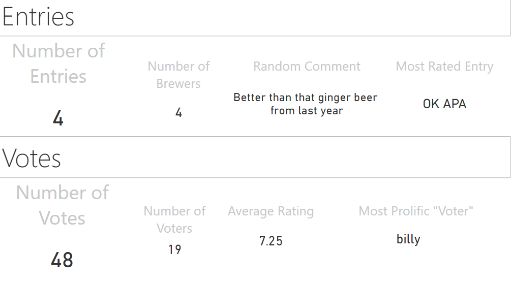
And the winning brewer... me!
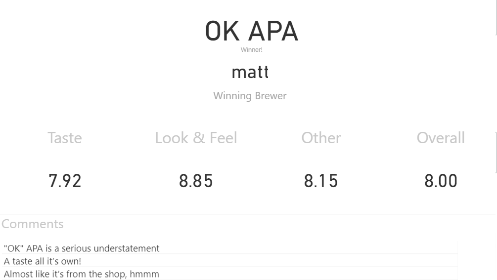
I mean, was that any surprise?
After all, I did write the voting system...